5 Design Trends for 2017
At Lab Creative, we often talk about how your brand design needs to be timeless and consistent, but that never means it has to stay stagnant. Design trends change and evolve, much like business itself, and your brand can always benefit from watching and understanding current design trends to see if they are relevant to your business and industry. I'm not saying to jump on every bandwagon you come across, but there may be things you can implement in your online and marketing efforts, your office/studio design or retail space, and your social media presence.
This year, the design world is seeing some exciting trends emerge. We’re seeing vibrant colours, minimalistic and contemporary logos and shapes, hand drawn graphics and fonts, custom photography, and exciting animation and graphics. I love the way design trends are moving these days, and I think you will too. If your Brand is due for a refresher, here are the 2017 design trends to consider. If you haven’t considered an update before now, perhaps something here will inspire you!
1. Colour Trends
Pantone Color Institute’s colour of the year is GREENERY PANTONE 15-0343A. It’s a fresh and uplifting green, described as a “refreshing and revitalizing shade, Greenery is symbolic of new beginnings.”The colour story speaks volumes to overall trends of a positive inspirational feeling, a human side to design, and a fresh take on established ideas.
We’re also seeing other vibrant and clear primary and secondary colours and a bit of a move away from muted or neon shades. These colour choices capture the mood of design trends getting back to basics in a contemporary way. A great example of this is the recent rebrand we did for Vibrant Work below.
2. Creative Minimalism
“Minimalism” in design is sometimes interpreted as cold or unfeeling. In 2017, minimalism is anything but. Contemporary minimalism captures the humanity of business owners, their clients, and the world around them in simple, recognizable shapes and colours. This is our style in a nutshell, so we couldn't be happier!
We don’t need all the bells and whistles, but we do want our Brand Essence to be revealed in a direct and uplifting way. We’re seeing new interpretations of negative spaces and line art as part of the same trend. Simple, spacious logos and designs tell your story in a clear and organized manner — and your customers and clients will remember it.
Think of the master card logo, which was updated last year to a more minimalistic version of the old design. In many ways, it's quite similar to the design that was originally created back in the 60's. Thankfully they kept the iconic overlapping circles, so it is still instantly recognizable just with a fresh, modern look. The font no longer has the dates drop shadow and squished lettering, opting for an all lowercase, friendly san-serif font.
After 20 years with the same logo, it was time for an evolution to the brand to evolve with the industry, and their target audience. It now reflects the company’s culture and aesthetic perfectly.
3. Handmade, Not “Homemade”
This is a trend I just adore, and I’ve seen great results for clients with it. Savvy audiences are tired of the same canned stock images and fonts. Why use the same font a dozen other businesses in town use for your logo and signage when you have the opportunity to create something truly unique with your Brand Design.
For one of my favourite recent clients, Leanne Kelly, we captured her Brand Essence with a range of artistic handmade mediums. We created an on-trend hand-lettered logo with unique watercolour, spray paint and marker patterns. The logo reflects her business in a memorable, modern way.
There is a fine line, however, between handmade design and “homemade” design. The 2017 creative trend is for highly professional and contemporary hand-drawn and hand-rendered images, logos, and fonts. These are not logos drawn at your kitchen table with your child’s marker; they take lettering and word art to a new level. These are typically paired with a more traditional serif or san-serif font, and there are hundreds of universal Google fonts that can complement a custom logo, so you can continue communicating your message on every platform seamlessly.
Take a look at new and upcoming boutiques and restaurants in your neighbourhood. Many are hiring professional designers to create their signage with unique lettering that puts a modern spin on penmanship with breathtaking custom lettering.
4. Custom Photography
Stock images just don't cut it any more. No one wants to see the same photograph on a website one day, on the side of a bus the next, and on a business card a week later, advertising a completely different business. Stock images can compromise your one-of-a-kind Brand Position in a hurry.
Stock photos still have their place when used sparingly, but consider a handful of custom professional photos for your major Brand Design projects. The investment in a small portfolio of professional photographs that capture the nature of your business and tell your story is worth its weight in gold.
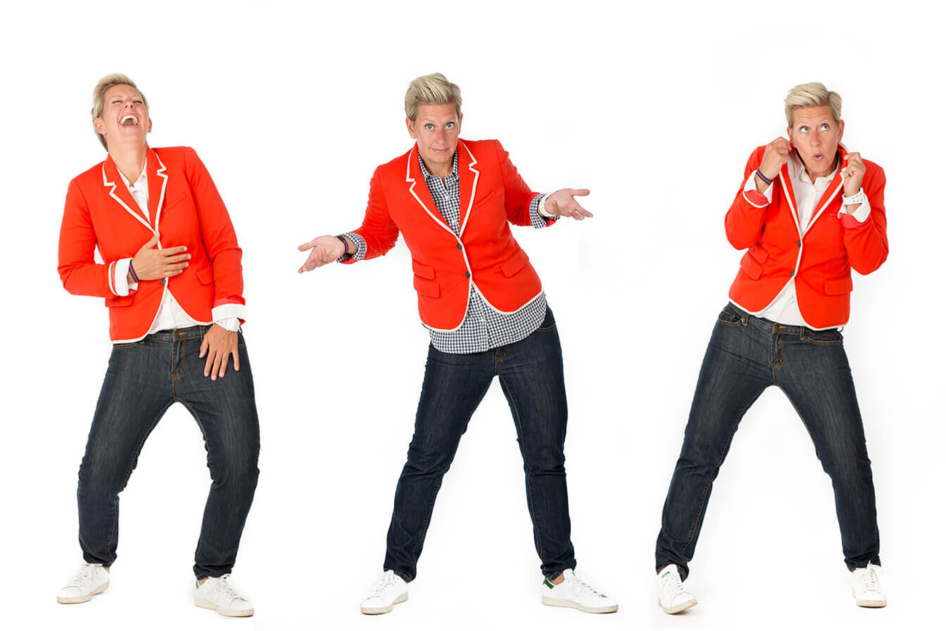
As a professional Comedian, Motivational Speaker and Author, Danny IS his brand and needed great photography to show off his personality. The same goes for Susan Stewart below.
If you’re in a design business, beautiful photographs of your work is a must! Like this one above for Beauparlant Design.
5. Animation and GIFs
While a website with flashing lights, a dancing mascot and loud digital music will have potential clients clicking away faster than you can say “GIF”, the tasteful, modern use of animation and GIF in your web-based designs and social media presence can have profound special effects on your business.
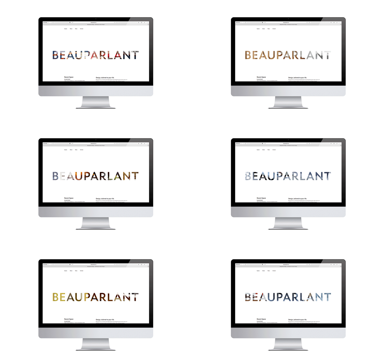
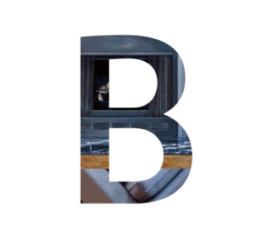
We recently updated a client’s web site to include a tailored logo of its name. On the home page, we layered the logo with scrolling portfolio photos of its architectural and interior design projects. The effect was simple, but highly effective at sharing the firm’s expertise and design sense in a single word.
If your Brand is looking a little stale or your website or marketing presence is due for an update, the current design trends can help you make your mark and stand out from the competition. The contemporary move towards more custom, creative Brand Design is exciting not only from a visual standpoint, but also from an entrepreneurial view.
If you’re ready to get on trend for success in 2017, click here to get in touch and learn how Lab Creative can help.


