Social Media Graphic Sizing Guide 2017
UPDATE: Facebook, Twitter and Linkedin recently changed their profile images to circles so our information below has been updated to reflect this.
Creating the various graphics needed across all of your social media platforms can be tedious and confusing so we've created this easy to follow and up-to-date guide for 2017. At the bottom of the page you'll even find a handy file to download with everything all together as a reference guide!
So there are what feels like a million different social media platforms so we're picked the big 5 (at least in our eyes)! Facebook, Youtube, Twitter, Instagram and Linkedin.
1. Facebook
For our Lab Creative Facebook page, we use our logo as our profile picture - which we recommend for most businesses and we are using the cover image as a place to tell people about our free giveaway and linked that to the sign up button below.
2. Youtube
Our client Lynn Woodman, uses video for her business so a Youtube channel was essential. The sizing variation for Youtube is quite large so the graphic had to be simple with lots of space around the safe area.
3. Twitter
Our client Danny Pehar has a huge following on twitter with over 80k followers so it was important for his twitter profile to match his new branding.Tip: Remember to be consistent with the colours, fonts and image(s) you use on all your social media. This helps your clients and potential clients find you!
4. Instagram
For Beauparlant, Instagram is the main place they reaching out to their auidience. With gorgeous images of their architecture, interiors and furniture, a visual platform like Instagram is perfect.
Tip: Plan out your social media feed so there is a flow. Go by project, colour, style and don't forget to inject a few photos of you doing your thing! People love to see you as well...just not too many selfies!
5. Linkedin
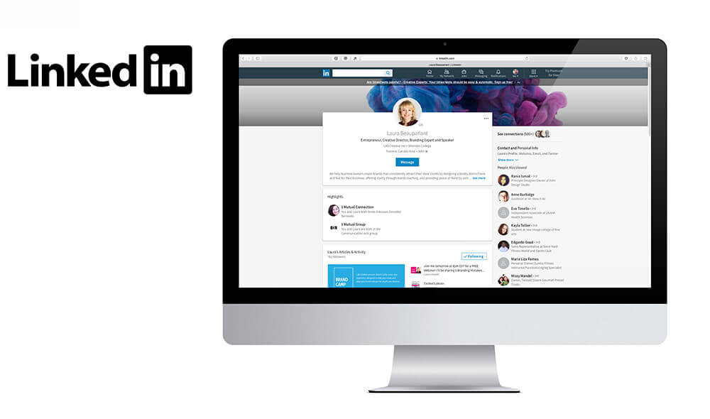
Linkedin recently changed the shape and dimensions of your profile and background photos. I recently updated mine with the headshot I use everywhere as well as the gorgeous science experiment photo we've been incorporating into our Branding. I love that it feels like a creative explosion behind my head!
Tip: Your Linkedin profile is about you and not your business. You can create a separate company page that is specifically about your business.
I've created the specs above in a handy cheat sheet and you can download it here or by clicking on the image above. I hope you find it useful! Don't forget to save it as for reference!And as always I'd love your feedback and free to share with any of your friends struggling to figure out these dimensions!


