Modern Business Signage Design
A Great Sign Helps Tell Your Story
You probably don’t put too much conscious thought into the signs you see everyday, but great signage should never be underestimated.
When you invest time, energy, and money in building your business, it’s important that your signage design reflect the values and the messages you are trying to communicate with your brand. In fact, for many retail or service-related industries, your signage, both exterior and interior, is often the first point of reference your customers and clients have to understand and remember your business.
A great sign has to fulfill a lot of roles:
it needs to be a location marker — one that new and established clients can see from afar, recognize, and remember as they visit your office or shop;
it needs to reflect and reinforce your brand in terms of colour and design;
it needs to set the tone for your business practices; and
it needs to provide useful and important information in a clear, accessible manner.
At Lab Creative, it is always exciting to hear that a client is building a new office space. Recently we had the pleasure of designing signs for the new office space for Full Radius Orthopaedics, an orthopaedic clinic with three surgeons based in Newmarket, Ontario.
After establishing the practice’s branding, visual design and logo guidelines, we were able to check out the fresh, modern new space for a site visit to plan and measure for all new signage. A lot of thought was involved in the process.
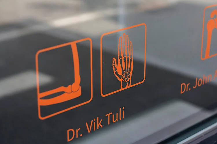
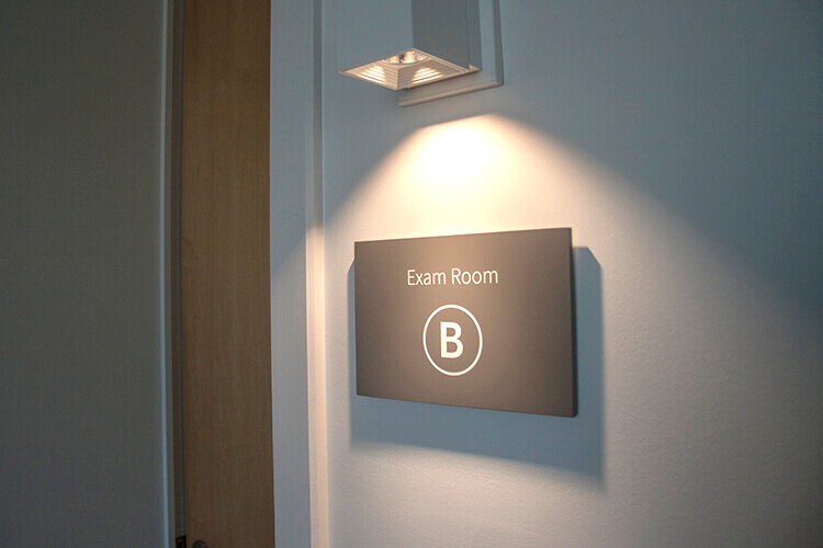
The surgeons needed a large exterior logo and number so new patients could easily find their office. Illegal parking can be an issue at their location, so custom parking signs were an absolute must to ensure there was always room for their patients to park. They also needed interior signs to indicate where each doctor’s office and the exam rooms were located.
Ultimately, we decided to use bold channel letters for the large exterior logo and number and vinyl lettering on the entrance door, making the most of the practice’s eye-catching modern logo and colour scheme. In the foyer, we created a stunning, large-scale glass directional sign that represents the brand and fits with a clean, contemporary office decor, with coordinating signs for each doctor’s office and exam room.
All of the signage created for Full Radius Orthopaedics welcomes its patients and provides vital information when they enter the office, making everyone in this busy health-care environment feel comfortable and informed.
What story is your signage telling your customers and clients?
Before creating signage, which is an expensive undertaking, it’s important to have clarity around the foundation and messaging to ensure the visual design stand out and has longevity. If you think you’re brand needs a revamp we'd love to hear from you.


